















Book Jacket
The Come Up: An Oral History of the Rise of Hip-Hop
Objective
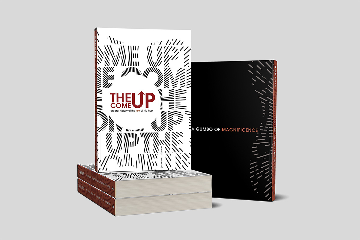
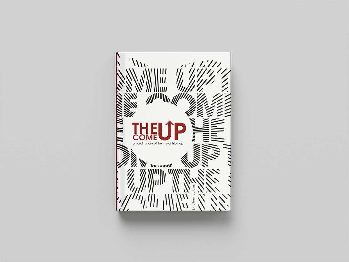
Design a dust jacket for Jonathan Abrams' The Come Up: An Oral History of the Rise of Hip-Hop using only black, white, and one accent colour. Red was selected for its stark contrast and ability to command attention. Font choices were limited to four options, with ITC Avant Garde chosen for its versatility across the design.
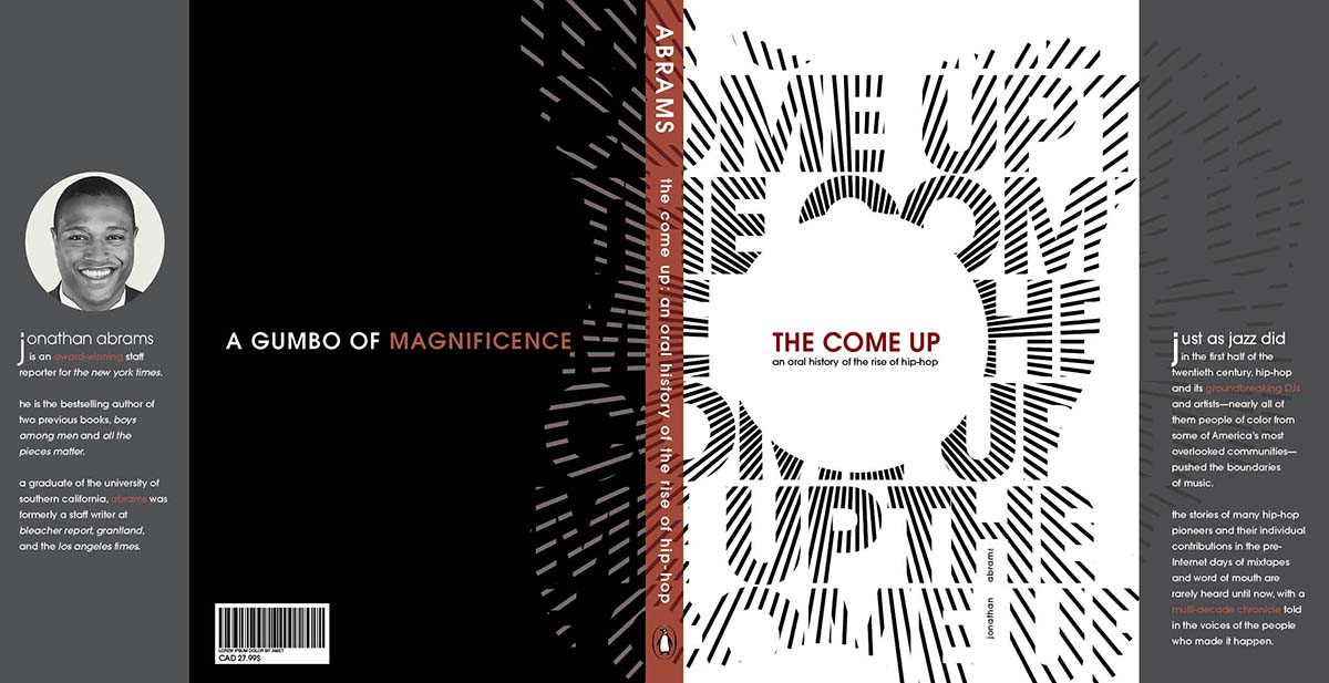
Last draft before final iteration
The final jacket was refined through multiple iterations, narrowing in on the strongest balance of impact, clarity, and cohesion.
Typography
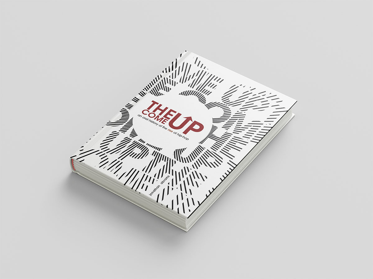
ITC Avant Garde was chosen for its graphic clarity and strong geometric character, which suited the bold, high-contrast direction of the cover.
Composition
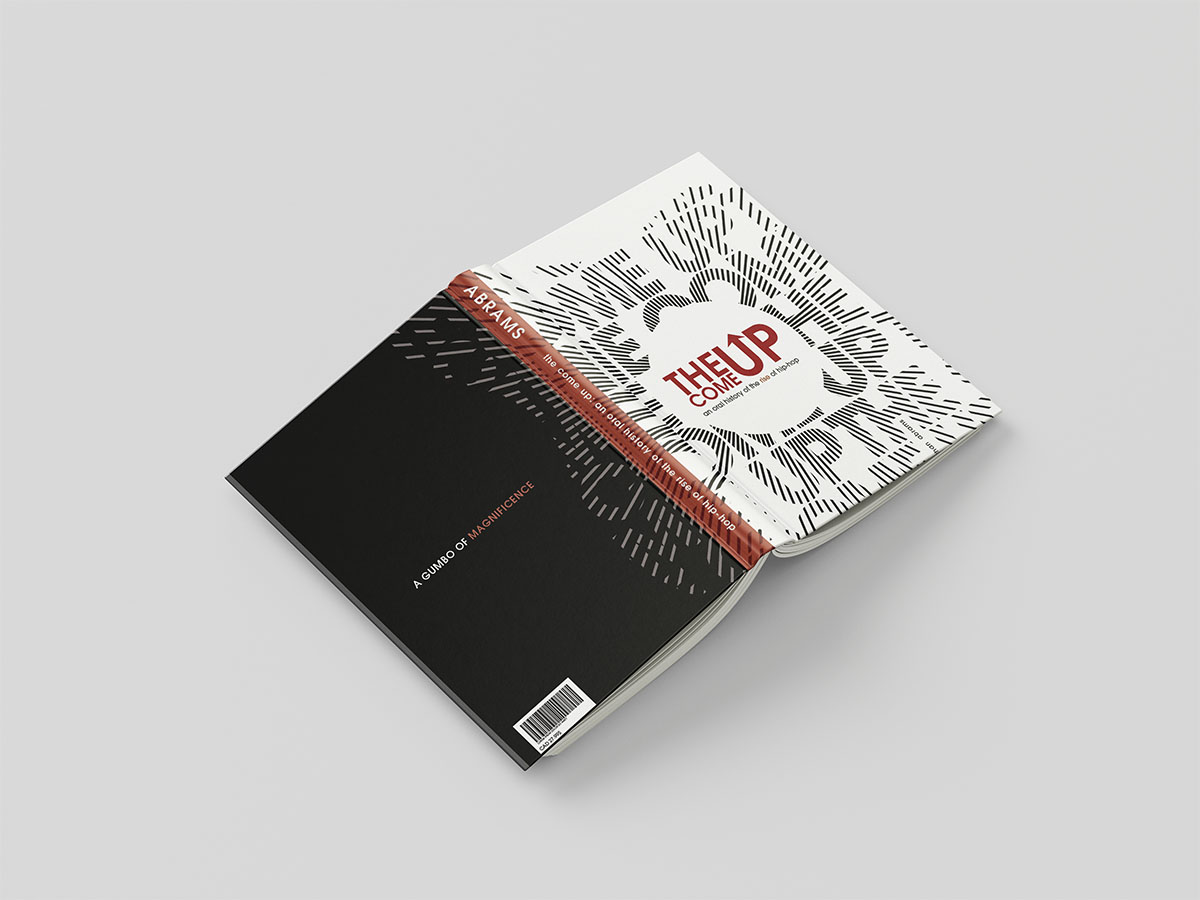
The layout was developed to feel striking and immediate, using scale, contrast, and spacing to hold attention while still keeping the information legible.
A round soundwave form was used to tie in with the overall theme of music, representing a modern tool used that in turn radiates outwards, as has done the impact of the hip-hop genre globally.
Colour Use
Red acts as the sole accent colour, bringing energy and urgency to the design while standing out sharply against the black and white palette.